top of page
FEED MY PEOPLE
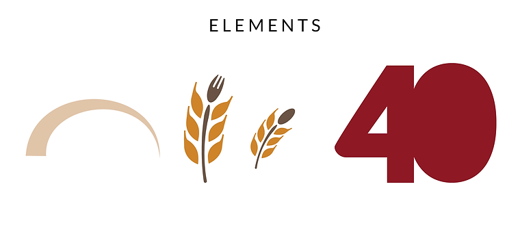
40th Anniversary Logo
The local nonprofit requested a special 40th anniversary logo, using their existing logo and brand colors as a base. For this design, we chose ruby red as the main logo color as it is the official color for 40th anniversaries. I offered the client a few options but they gravitated toward this modern, negative space concept. I chose to use negative space in adding "years" at the bottom as well, to blend the word into the artwork.


bottom of page